Dashboards
ZMON’s customizable dashboards enable you to configure widgets and choose which alerts to show. Dashboards have the following fields:
- name
- The dashboard’s name. This is mainly used to identify the dashboard.
- default view
The dashboard default view. Here you can specify the default rendering behavior when you open the dashboard. There are two options available:
- Full: Provides detailed information about the alert. Useful when using big screens.
- Compact: Only displays the alert message. Useful for small screens.
Note: You can toggle the view in the dashboard by clicking on the top right button of the alert container.
- edit mode
Here you can specify who can modify your dashboard. There are three options available:
- Private: Only you (and the admin) can edit the dashboard
- Team: All members of your team(s) can edit the dashboard
- Public: Everyone can edit the dashboard
- widget configuration
The widget configuration defines the different widgets that the current dashboard has. An example of a valid widget configuration is the following:
[
    {
        "checkDefinitionId": 1,
        "entityId": "GLOBAL",
        "type": "gauge",
        "title": "Order Failure %",
        "options": {
            "max": 35
        }
    },
    {
        "checkDefinitionId": 4,
        "entityId": "GLOBAL",
        "type": "gauge",
        "title": "Random",
        "options": {
            "max": 100
        }
    },
    {
        "checkDefinitionId": 5,
        "entityId": "my_db_name-live",
        "type": "value",
        "title": "My database value"
    }
]
Supported widget types are:
- gauge
- chart
- value
- networkmap
- iframe
In order to edit a specific dashboard, go to the dashboard tab, and click the edit button. To set it as active, just click on its name.
In order to be able to create or edit a new dashboard, user should be logged in. Unless you have the admin role, you will only be able to edit the dashboards you created.
Widgets will automatically spread out across the whole width, i.e. if you define two widgets both will take about 50% of screen width.
- alert teams
Here you can specify a list of patterns to filter alerts by team or responsible team you want to display (wildcards using * are allowed)
Example: All incident alerts (including sub-teams)
[
 "Incident*"
]
value, gauge, chart, trend
The value widget will show the check value with a big font. The gauge will show a gauge from “min” to “max”. The chart will show the history of check values. The trend will show a trend arrow (going up or down).
These widgets expect a “checkDefinitionId”, “entityId” and “title” properties:
- “checkDefinitionId” - self-explanatory. Data in widget is based on check results
- “entityId” - if your check is based on GLOBAL, leave “GLOBAL”, otherwise specify name of entity (as it appears in alert details) that you will use to get the data from (as check returns one result for each entity).
- “title” - text displayed in the top part of the widget.
For chart widgets, instead of using “checkDefinitionId” + “entityId”, you can also define the data to be shown using a KairosDB query.
They’ll share the full screen width unless you set the “width” property, ranging from 12 (full width, calculated in “columns”, see Bootstrap) to 2 (smallest meaningful) or even 1.
Configuration options can be defined inside an “options” property. Each widget accepts a different set of options.
Value widgets accept “fontSize”, “color” and “format” properties. Additionally you can set a specific JSON value of the check result to be displayed by using the “jsonPath” property, in case the result is a JSON object instead of a string / number.
A font size can be specified with the “fontSize” property, with numbers (in pixels) for the desired size.
A color for the font can be specified with the “color” property.
A formatting string can be also specified to make python-like string interpolation and floating point precision rounding, by defining a “format” property in the options object. Syntax of the format string is mostly same as in python.
Options example for all widgets to specify which value from the check result to be displayed using “jsonPath”:
"options": {
    "fontSize": 120,    # set font size to 120px,
    "color": "red",     # set color to red (also accepts #FF0000).
    "format": ".3f"     # show value with 3 places of floating point precision
},
"jsonPath": ".cpu.load1"
Check the documentation of JSONPath for more info on how to use the jsonPath property. Please note that you don’t need to use the $ symbol, as it’s prepended automatically on parsing.
Charts can be configured by defining an “options” property. All options available to Flot charts can be overridden here, plus some extra options like stacked mode. The following shows an example of a stacked area chart with customized colors.
Series of data can be filtered, so that Charts show only the customized data you want to see. To specify which data series you want visible, define the ‘series’ property as an array of names of the data series as showed below.
{
    "type": "chart",
    "title": "Orders+Failures/m",
    "checkDefinitionId": 131,
    "entityId": "GLOBAL",
    "options": {
        "series": {
            "stack": true
        },
        "colors": [
            "#ff3333",
            "#33ff33"
        ]
    "series": [ "Mean", "Peak" ]
}
See the Flot documentation for more details.
Data from KairosDB-queries
As detailed in the Grafana3 and KairosDB section, all ZMON check data is saved into KairosDB, and
can be queried from there. For chart widgets, you can directly use
a KairosDB query in the options
section of a widget to specify the data series to be used.
The query consists of the key metrics (which indicates the data series to use)
and a time specifier, for our purposes usually start_relative. In addition you can use
cache_time (in seconds) to indicate that a previous result can be reused.
Here is an example which shows the values of check 1 for just three of its entities.
{
    "options": {
        "lines": {},
        "legend": {
            "backgroundOpacity": 0.1,
            "show": true,
            "position": "ne"
        },
        "series": {
            "stack": false
        },
        "start_relative": {
            "unit": "minutes",
            "value": "30"
        },
        "metrics": [
            {
                "tags": {
                    "entity": [
                        "website-zalando.de",
                        "website-zalando.ch",
                        "website-zalando.at"
                    ],
                    "key": []
                },
                "name": "zmon.check.1",
                "group_by": [
                    {
                        "name": "tag",
                        "tags": [
                            "entity",
                            "key"
                        ]
                    }
                ]
            }
        ],
        "cache_time": 0,
        "colors": [
            "#F00",
            "#0F0",
            "#00F"
        ]
    },
    "type": "chart",
    "title": "Response time (just de/at/ch)"
}
An easy way to compose the KairosDB queries (specially the value for metrics) is to
create a new Grafana Dashboard in the built-in Grafana and then copy the query from the
requests sent by the browser (Developer Tools → Network in Chromium).
IFRAME
The Iframe widget is a simple widget that allows you to embed a thrid party page in a widget container.
For browser security reasons, only same-domain source urls can be used.
Style property is used to set scale and size of iframe inside the widget container. Normally widths and heights bigger than 100% will be used, and scales around 0.5 are also common.
Reload after a given amount of miliseconds can be done by setting the ‘refresh’ property.
Sample iframe widget:
{
    "type": "iframe",
    "src": "http://example.com",
    "style": {
        "width": "180%",    // Width to be occupied by iframe (px or %).
        "height": "180%",   // Height to be occupied by iframe (px or %).
        "scale: 0.54        // Scaling ratio
    },
    "refresh": 60000        // time in miliseconds after which the iframe content will be reloaded.
}
Alert Age
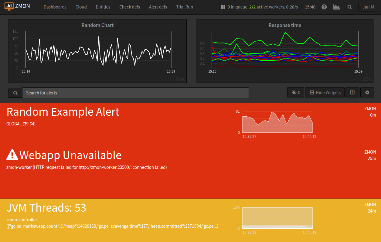
In the rightmost column of each alert block on the dashboard, the age of that alert is shown. An entry of “28m”, for example, indicates that the alert is 28 minutes old.
If an alert is raised for multiple entities, the alert age is based on the entity for which the alert has been raised first. Entities in downtime are ignored for determining alert age, but when an entity leaves downtime, the length of time it spent in downtime is taken into account.
An example:
time event entity A entity B alert age 00:00 alert is raised for entity A raised for 0h not raised 0h 01:00 alert is raised for entity B raised for 1h raised for 0h 1h (from entity A) 02:00 alert enters downtime for entity A raised for 2h, in downtime raised for 1h 1h (from entity B) 03:00 alert leaves downtime for entity A raised for 3h raised for 2h 3h (from entity A) 04:00 alert is cleared for entity A not raised raised for 3h 3h (from entity B) 05:00 alert enters downtime for entity A not raised, in downtime raised for 4h 4h (from entity B) 06:00 alert is raised for entity A raised for 0h, in downtime raised for 5h 5h (from entity B) 07:00 alert leaves downtime for entity A raised for 1h raised for 6h 6h (from entity B) 08:00 alert is cleared for entity B raised for 2h not raised 2h (from entity A)
Widgets styling and effects based on active alerts
You can change the styling or add a blinking effect to widgets in case one or more alerts are active at the moment. This is done by using the “alertStyles” option, like the sample below:
{
    "type": "gauge",
    // Some widget configuration here...
    "alertStyles": {
        "blink": [1, 4, 20],
        "red": [9]
    }
}
On the sample below the gauge widget will blink if alert 1, 4 or 20 is active, and make the background red if alert 9 is active. At the moment the following effects are defined:
- blink: will blink the whole widget (opacity 0 to 100%, 1 second interval)
- shake: will start shaking the widget
- red: set the background to red
- orange: set the background to orange
- yellow: set the background to yellow
- green: set the background to green
- blue: set the background to blue
Please note that you can mix different styles and alerts, as shown on the previous sample. If alerts 1 and 9 are active, it will blink with a red background. If you define different styles with the same alert ID it will always give priority to the last one.